98 views

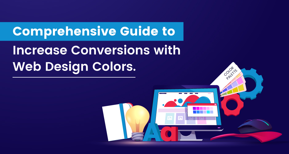
Color psychology on websites plays a vital role for web designers and marketers. As it directly molds the user’s behavior and emotions. This comprehension is the primary factor in crafting website web designs that bring out the intended results. Colors have a diverse effect in showcasing people’s mindsets as they display the intentions of users. If these colors match the mindset of users, then they are likely to convert from users to customers. This blog explores the basics of color psychology, digging into the meanings of different colors. It guides you in picking the right colors to make people feel certain emotions and demonstrates how smart color choices can make a website work better.
When designing your website for marketing and advertising, it’s important to consider the colors you use. Color psychology suggests that certain colors can influence customers’ decisions. So, be careful in choosing colors that grab the attention of first-time visitors.
In this blog, you will get a detailed, step-by-step guide that focuses on elevating web design to increase conversion rates effectively.
Boosting Conversions: The Impact of Color Choices
Using colors isn’t just about making things look good; it’s a powerful tool that can shape how we feel and think as soon as we see something.
There’s a legitimate sub-field in behavioral psychology solely dedicated to unraveling the profound impact of color on human behavior which is known as color psychology. In the spheres of marketing and Web Design Services, professionals are increasingly acknowledging its importance and working to grasp its subtleties for effective integration into their respective domains.
Many studies have explored how colors affect, how people feel and think. One important study shows how using the right colors in branding is crucial for how people see a brand. Another study emphasizes how well-known brands are important, and it points out that the colors used play a big role in creating a brand’s identity.
Nowadays, marketers and talented web designers use their knowledge of colors to make people react in a certain way. They intentionally use color psychology in web design to get attention and create specific feelings. This helps shape how people behave on a website and encourages them to do what the designers want.
7 Simple Ways on How Colors Affect Feelings
In the busy business world today, companies must find special ways to be noticed and connect with their customers due to tough competition. The best way to do this is by using color psychology as a part of their plan.
Explore a variety of effective techniques to harness color psychology, increase conversions, and foster deeper customer engagement.
- Crafting Emotional Designs
Start by figuring out the feeling you want to make your audience have—whether it’s fear, curiosity, or confidence. This applies whether you’re rethinking your brand’s colors or picking colors for new ads. Once you know the reaction you want, pick the right color to make sure it has a good effect. - Deliberate Colour Placement
It’s important to think carefully about the colors you use on your webpage. While trying to create focus is good, having a webpage that’s all red can be too much. As a rule, follow this guide for how to spread out the colors:- 60% for your background: Since your background constitutes the largest visual aspect of your landing page, dedicate 60% of your color scheme to it.
- 30% for your base color: The second most prominent visual area, encompassing your header, footer, and potentially your contact form, should account for 30% of your color palette.
- 10% for your accent color: Save your accent color for pivotal elements such as your call-to-action button. Despite comprising just 10% of your page, ensure it stands out by employing a contrasting color to capture attention effectively.
- Know Your Audience Intimately
Colors can make people feel different emotions and react in various ways. It’s important to know your audience and what colors they like. For example, if most of your audience is female, using more feminine colors in your design can have a strong impact. - Employ Strategic Contrasts
Select vibrant colors that contrast well to highlight key elements on your website, such as buttons or product images, making them easily noticeable. Ensure the colors complement each other to direct people’s attention towards the desired actions. - Embrace Color Harmony
Use colors that go well together to make your design look nice and appealing. Analogous color schemes, which use colors next to each other on the color wheel, create a sense of harmony and balance. This can make the user’s experience better and might even make more people do what you want on your website. - Accentuate Key Elements
Use color to highlight important parts of your website. Choose a vibrant and distinct color for your “click here” button so that it stands out, making people notice it and feel like clicking on it. - Maintain Consistency Throughout
Consistency plays a pivotal role in integrating color psychology effectively. Implement a cohesive color palette across your website design to build a unified brand identity and foster trust with your audience, ultimately boosting the probability of conversions.
Colors in Web Design: Impact on Conversions Simplified
- Red
Red is widely known as the color of passion and is linked to strong emotions like anger, jealousy, danger, and violence. Because it can evoke intense feelings, it’s a good choice for creating a sense of urgency in marketing. For example, during a clearance sale, using a red graphic with white details can strongly encourage people to quickly check out your store, whether it’s online or in person, to get the attractive deals available. That’s why promotional materials with big discounts often use this attention-grabbing color. - Green
Green is strongly linked to the environment and represents being environmentally conscious and supporting conservation efforts. Besides its eco-friendly connection, green is also related to making decisions, making it a good choice for business. The color’s calming appearance and the fact that the brain finds it easy to understand contribute to why it’s liked in many different situations. - Orange
Orange is a mix of red and yellow, so it has qualities from both colors. Like yellow, it gives off warmth and a happy feeling. The red part of the orange is also good at creating a sense of urgency, which is why it’s often used for important calls to action. - Yellow
Yellow is the go-to color for making people feel warm, cheerful, and joyful, and some folks strongly connect it with optimism and a youthful feeling. However, the web design team needs to be careful with how they use it. They should use it wisely to avoid using too much of a bright color palette, which could be too much and might turn visitors away instead of getting them interested. - Black
People often associate black with ideas of death and darkness, and it can make them feel oppressed and gloomy. However, it’s important to note that black also gives off a feeling of elegance and glamour. This is why it’s commonly used in ads for luxury products, as it effectively shows a sense of power. - Blue
Blue is a common choice in the business world, especially in finance, and it’s notably used by Facebook, the largest website globally. Businesses like blue because it’s connected to qualities like security, reliability, intelligence, safety, and trust. Besides its professional look, blue is also associated with feelings of calmness, coolness, and serenity. Some even think it might help lower blood pressure and heart rate. However, it’s important to know that, in language, blue is also connected to sadness, giving it a varied meaning. - White
In the Western world, white carries a rich symbolism of innocence, purity, and virtue. It’s no surprise then that it finds a prominent place in web design, often acting as a blank canvas upon which other elements paint their stories. Hospitals leverage white’s association with cleanliness and hygiene, creating a sense of sterile calm. Beyond healthcare, countless industries utilize the versatility of white, from minimalist fashion brands to sleek tech startups.
But why is white so popular in web design? Its key strengths lie in its ability to:
- Enhance clarity and readability: White backgrounds provide optimal contrast for text and visuals, making them easier to digest and understand.
- Create a spacious and airy feel: Whitespace is a powerful tool in web design, offering a sense of openness and breathing room. This can be particularly effective for minimalist or product-focused websites.
- Amplify other colors: White acts as a neutral backdrop, allowing pops of color to truly shine and captivate the user’s attention. This versatility makes it ideal for websites with dynamic color palettes.
- Foster trust and professionalism: White traditionally evokes feelings of purity, honesty, and professionalism, attributes highly valued in many web design projects.
Of course, using white effectively in web design requires careful consideration. Overdoing it can create a sterile or cold atmosphere, and improper contrast with text or visuals can hinder usability. But when wielded skillfully, white can become a powerful ally, shaping a clean, impactful, and user-friendly online experience.
So, the next time you visit a website bathed in pristine white, remember it’s not just a color choice; it’s a deliberate design decision aimed at evoking trust, clarity, and a user-friendly experience. And that’s the true power of white in web design.
Conclusion
Understand the continuous process of making your website better at getting people to do what you want -look at the traffic, improve the web pages, and try out different versions. This organized way of doing things should smoothly fit into your overall plan. Before making any changes to your website based on these ideas, it’s very important to check if they work by looking at the data.
The main goal is to make more people do what you want on your website. Go through the feelings of each color that brings up and pick the ones that go well with your website. Whether you’re making a new site or improving an old one, choosing the right colors is important.
W3Era, a Digital Marketing Company, stands out for its expertise not only in digital marketing but also for its specialization in delivering services that skillfully showcase the power of color in web design. Our firm expertise aims to significantly boost conversions for your business through strategic color implementation. Explore the transformative impact of our services on your web presence. Elevate your business success with our proficiency in optimizing color for enhanced conversions.
- SEO Powered Content & PR Distribution. Get Amplified Today.
- PlatoData.Network Vertical Generative Ai. Empower Yourself. Access Here.
- PlatoAiStream. Web3 Intelligence. Knowledge Amplified. Access Here.
- PlatoESG. Carbon, CleanTech, Energy, Environment, Solar, Waste Management. Access Here.
- PlatoHealth. Biotech and Clinical Trials Intelligence. Access Here.
- Source: https://www.w3era.com/web-design-color-hacks-to-double-conversions/


