Did you spot a recent change to Physics World magazine? Robert P Crease reveals all

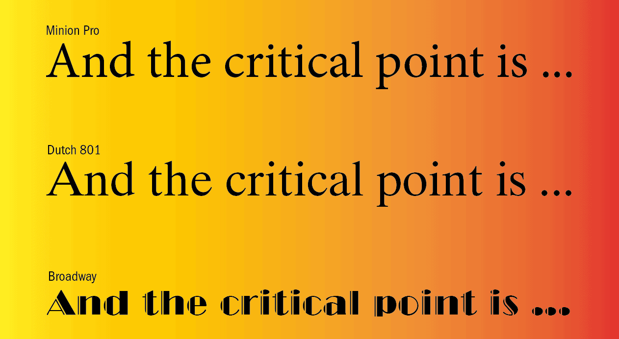
This January, something at Physics World changed. It took place right before our eyes, but practically no-one noticed. It concerns the body text of all articles in the print version of Physics World magazine, which had been set in a font called Dutch 801 for more than 15 years. Now, however, they are in Minion Pro. Headlines, standfirsts and captions, meanwhile, use a subtly different version of Franklin Gothic.
How could such a radical and transparent makeover have been missed by our print readers? To find out, I sought out Robert Bringhurst, whom I consider the leading authority on typography. Based on an island north of Vancouver in British Columbia, Bringhurst is the author of The Elements of Typographic Style, which was first published in 1992 and has been revised over half a dozen times since. The 400-page book is a compendium of everything there is to know on typography – its forms, histories and explanations – written with sparkling prose and astute observations.
The realm of typography is a “magic forest”, according to Bringhurst, endowing human language with “a durable, visible form, and thus with an independent existence”. While some areas in that forest are well travelled, many are spectacular and wild. In the far-out font Beowolf, for instance, computers introduce tiny random perturbations into the letters, making each slightly dissimilar and reading them a surprisingly fresh experience.
Physicists might not realize, but typography has a huge impact on the reading experience. Bad design, Bringhurst says, makes “the letters mill and stand like starving horses in a field”, while careless design makes them “sit like stale bread and mutton on the page”. Good design involves an “energetic repose” whose paradoxical ambition is to draw our eyes in and then vanish. The late Beatrice Ward, Bringhurst’s scholarly predecessor, compared typography to a crystal goblet, “because everything about it is calculated to reveal rather than hide the beautiful thing which it was meant to contain”.
Moreover, Bringhurst writes, choosing a font is like framing a painting in that it has to suit the contents. Think, he says, of how silly “a cubist painting in an eighteenth-century gilded frame” would be. Or, closer to home, imagine if you had to read page after page of Physics World in Comic Sans – the supposedly playful font adopted in many cheesy PowerPoint presentations and even by future CERN boss Fabiola Gianotti when she announced the discovery of the Higgs boson in 2012.
Food and wine
I asked Bringhurst how readers typically react to new fonts. “It’s the same range of reactions you could expect if you changed the tableware and cutlery in a restaurant,” he replied in an e-mail. “In the journal and the restaurant both, it is presumably the food that really counts, but presentation counts for something too, and so it should. Reading, like eating, is partly, but only partly, a physical act.”
The presentation, Bringhurst continued, reveals the conscientiousness of the presenter. “I think that publishers, like civil engineers, highway maintenance workers and the gardeners tending the flowers in public parks, are morally obliged to do a good job because part of the social fabric – and a pretty important part of the social fabric – is in their hands.”
I pointed out that not everybody had a free hand in choosing a presentation. Those running magazines, for example, have to rely on expensive computer languages and formats developed and licensed by multinational corporations. “Of course, they stand outside the magic forest,” Bringhurst responded. “Publishing businesses have to be economically sound, so they can’t and don’t make purely ethical or aesthetic decisions.”
Physics World couldn’t. When the magazine’s production switched from scissors and paper to desktop publishing in the early 1990s, it used a technology recently developed by the computer software company Adobe. In that technology, a computer language called PostScript had been used to create a package of “Type 1” formats to display a variety of fonts – Dutch 801 and Franklin Gothic among them.
Dutch 801, however, lacked a full Greek alphabet and many mathematical symbols, so Physics World had to supplement it with Symbol, another Type 1 font. It was a messy compromise. Even when Adobe co-developed another format, called OpenType, in the late 1990s, Physics World and other publications held on. They’d invested so heavily in the Type 1 fonts that there was no huge reason to change.
Technology with characters: the story of China’s unique transformation
Then, in 2021, Adobe announced that it would stop supporting Type 1 fonts by the end of 2022, forcing Physics World to finally switch. The advantage of Minion – one of Adobe’s new OpenType offerings – is that it is very similar to Dutch 801 and fits about the same amount of text on the page. Physics World’s OpenType version of Franklin Gothic, meanwhile, was found from somewhere else. When I explained the shift to Bringhurst, he called it “a conservative but very good decision”.
The critical point
Typography is a curious case of something that involves both what philosophers call an “embodiment” relation, in which you perceive the world through something (like your glasses), and a “hermeneutic” relation, in which you look at a technology to read the world (like the numbers on a thermometer). Typefaces aspire to be both simultaneously, though they can be distracting if they call too much attention to themselves; imagine reading all of Physics World in the Broadway font (see illustration above).
Let me confess, I would not have noticed the typographic change had it not been for an editor’s passing remark. And if you’re reading this article on the Physics World website or the digital version of Physics World, the typography is unchanged, for the fonts were already suited for the digital experience. Like everyone else, I’m more interested in the food on the table and the wine in the goblet. But at least I’m now a little more appreciative of what it takes to put it there.
- SEO Powered Content & PR Distribution. Get Amplified Today.
- Platoblockchain. Web3 Metaverse Intelligence. Knowledge Amplified. Access Here.
- Source: https://physicsworld.com/a/read-all-about-it-how-typography-influences-your-understanding/