Logistics and transportation companies track ETA (estimated time of arrival), which is a key metric for their business. Their downstream supply chain activities are planned based on this metric. However, delays often occur, and the ETA might differ from the product’s or shipment’s actual time of arrival (ATA), for instance due to shipping distance or carrier-related or weather-related issues. This impacts the entire supply chain, in many instances reducing productivity and increasing waste and inefficiencies. Predicting the exact day a product arrives to a customer is challenging because it depends on various factors such as order type, carrier, origin, and distance.
Analysts working in the logistics and transportation industry have domain expertise and knowledge of shipping and logistics attributes. However, they need to be able to generate accurate shipment ETA forecasts for efficient business operations. They need an intuitive, easy-to-use, no-code capability to create machine learning (ML) models for predicting shipping ETA forecasts.
To help achieve the agility and effectiveness that business analysts seek, we launched Amazon SageMaker Canvas, a no-code ML solution that helps companies accelerate solutions to business problems quickly and easily. SageMaker Canvas provides business analysts with a visual point-and-click interface that allows you to build models and generate accurate ML predictions on your own—without requiring any ML experience or having to write a single line of code.
In this post, we show how to use SageMaker Canvas to predict shipment ETAs.
Solution overview
Although ML development is a complex and iterative process, we can generalize an ML workflow into business requirements analysis, data preparation, model development, and model deployment stages.
SageMaker Canvas abstracts the complexities of data preparation and model development, so you can focus on delivering value to your business by drawing insights from your data without a deep knowledge of the data science domain. The following architecture diagram highlights the components in a no-code or low-code solution.

The following are the steps as outlined in the architecture:
- Download the dataset to your local machine.
- Import the data into SageMaker Canvas.
- Join your datasets.
- Prepare the data.
- Build and train your model.
- Evaluate the model.
- Test the model.
- Share the model for deployment.
Let’s assume you’re a business analyst assigned to the product shipment tracking team of a large logistics and transportation organization. Your shipment tracking team has asked you to assist in predicting the shipment ETA. They have provided you with a historical dataset that contains characteristics tied to different products and their respective ETA, and want you to predict the ETA for products that will be shipped in the future.
We use SageMaker Canvas to perform the following steps:
- Import our sample datasets.
- Join the datasets.
- Train and build the predictive machine maintenance model.
- Analyze the model results.
- Test predictions against the model.
Dataset overview
We use two datasets (shipping logs and product description) in CSV format, which contain shipping log information and certain characteristics of a product, respectively.
The ShippingLogs dataset contains the complete shipping data for all products delivered, including estimated time shipping priority, carrier, and origin. It has approximately 10,000 rows and 12 feature columns. The following table summarizes the data schema.
ActualShippingDays |
Number of days it took to deliver the shipment |
Carrier |
Carrier used for shipment |
YShippingDistance |
Distance of shipment on the Y-axis |
XShippingDistance |
Distance of shipment on the X-axis |
ExpectedShippingDays |
Expected days for shipment |
InBulkOrder |
Is it a bulk order |
ShippingOrigin |
Origin of shipment |
OrderDate |
Date when the order was placed |
OrderID |
Order ID |
ShippingPriority |
Priority of shipping |
OnTimeDelivery |
Whether the shipment was delivered on time |
ProductId |
Product ID |
The ProductDescription dataset contains metadata information of the product that is being shipped in the order. This dataset has approximately 10,000 rows and 5 feature columns. The following table summarizes the data schema.
ComputerBrand |
Brand of the computer |
ComputeModel |
Model of the computer |
ScreeenSize |
Screen size of the computer |
PackageWeight |
Package weight |
ProductID |
Product ID |
Prerequisites
An IT administrator with an AWS account with appropriate permissions must complete the following prerequisites:
- Deploy an Amazon SageMaker domain. For instructions, see Onboard to Amazon SageMaker Domain.
- Launch SageMaker Canvas. For instructions, see Setting up and managing Amazon SageMaker Canvas (for IT administrators).
- Configure cross-origin resource sharing (CORS) policies in Amazon Simple Storage Service (Amazon S3) for SageMaker Canvas to enable the upload option from local disk. For instructions, see Give your users the ability to upload local files.
Import the dataset
First, download the datasets (shipping logs and product description) and review the files to make sure all the data is there.
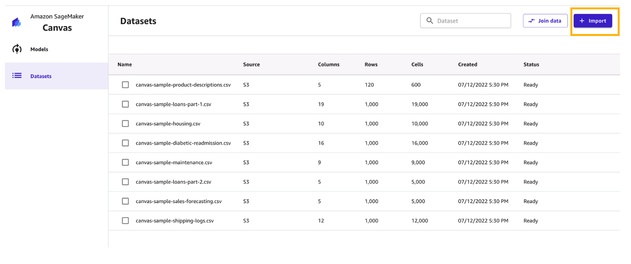
SageMaker Canvas provides several sample datasets in your application to help you get started. To learn more about the SageMaker-provided sample datasets you can experiment with, see Use sample datasets. If you use the sample datasets (canvas-sample-shipping-logs.csv and canvas-sample-product-descriptions.csv) available within SageMaker Canvas, you don’t have to import the shipping logs and product description datasets.
You can import data from different data sources into SageMaker Canvas. If you plan to use your own dataset, follow the steps in Importing data in Amazon SageMaker Canvas.
For this post, we use the full shipping logs and product description datasets that we downloaded.
- Sign in to the AWS Management Console, using an account with the appropriate permissions to access SageMaker Canvas.
- On the SageMaker Canvas console, choose Import.
- Choose Upload and select the files
ShippingLogs.csvandProductDescriptions.csv. - Choose Import data to upload the files to SageMaker Canvas.

Create a consolidated dataset
Next, let’s join the two datasets.
- Choose Join data.

- Drag and drop
ShippingLogs.csvandProductDescriptions.csvfrom the left pane under Datasets to the right pane. The two datasets are joined using
 ProductIDas the inner join reference. - Choose Import and enter a name for the new joined dataset.
- Choose Import data.

You can choose the new dataset to preview its contents.

After you review the dataset, you can create your model.
Build and train model
To build and train your model, complete the following steps:
- For Model name, enter
ShippingForecast. - Choose Create.
 In the Model view, you can see four tabs, which correspond to the four steps to create a model and use it to generate predictions: Select, Build, Analyze, and Predict.
 - On the Select tab, select the
ConsolidatedShippingDatayou created earlier.You can see that this dataset comes from Amazon S3, has 12 columns, and 10,000 rows. - Choose Select dataset.

SageMaker Canvas automatically moves to the Build tab. - On the Build tab, choose the target column, in our case
ActualShippingDays.
Because we’re interested in how many days it will take for the goods to arrive for the customer, SageMaker Canvas automatically detects that this is a numeric prediction problem (also known as regression). Regression estimates the values of a dependent target variable based on one or more other variables or attributes that are correlated with it.Because we also have a column with time series data (OrderDate), SageMaker Canvas may interpret this as a time series forecast model type. - Before advancing, make sure that the model type is indeed Numeric model type; if that’s not the case, you can select it with the Change type option.

Data preparation
In the bottom half of the page, you can look at some of the statistics of the dataset, including missing and mismatched values, unique values, and mean and median values.
Column view provides you with the listing of all columns, their data types, and their basic statistics, including missing and mismatched values, unique values, and mean and median values. This can help you devise a strategy to handle missing values in the datasets.

Grid view provides you with a graphical distribution of values for each column and the sample data. You can start inferring relevant columns for the training the model.

Let’s preview the model to see the estimated RMSE (root mean squared error) for this numeric prediction.

You can also drop some of the columns, if you don’t want to use them for the prediction, by simply deselecting them. For this post, we deselect the order*_**id* column. Because it’s a primary key, it doesn’t have valuable information, and so doesn’t add value to the model training process.
You can choose Preview model to get insights on feature importance and iterate the model quickly. We also see the RMSE is now 1.223, which is improved from 1.225. The lower the RMSE, the better a given model is able to fit a dataset.

From our exploratory data analysis, we can see that the dataset doesn’t have a lot of missing values. Therefore, we don’t have to handle missing values. If you see a lot of missing values for your features, you can filter the missing values.
To extract more insights, you can proceed with a datetime extraction. With the datetime extraction transform, you can extract values from a datetime column to a separate column.
To perform a datetime extraction, complete the following steps:
- On the Build tab of the SageMaker Canvas application, choose Extract.
- Choose the column from which you want to extract values (for this post,
OrderDate). - For Value, choose one or more values to extract from the column. For this post, we choose Year and Month.The values you can extract from a timestamp column are Year, Month, Day, Hour, Week of year, Day of year, and Quarter.
- Choose Add to add the transform to the model recipe.

SageMaker Canvas creates a new column in the dataset for each of the values you extract.

Model training
It’s time to finally train the model! Before building a complete model, it’s a good practice to have a general idea about the performances that our model will have by training a quick model. A quick model trains fewer combinations of models and hyperparameters in order to prioritize speed over accuracy. This is helpful in cases like ours where we want to prove the value of training an ML model for our use case. Note that the quick build option isn’t available for models bigger than 50,000 rows.

Now we wait anywhere from 2–15 minutes for the quick build to finish training our model.

Evaluate model performance
When training is complete, SageMaker Canvas automatically moves to the Analyze tab to show us the results of our quick training, as shown in the following screenshot.
You may experience slightly different values. This is expected. Machine learning introduces some variation in the process of training models, which can lead to different results for different builds.

Let’s focus on the Overview tab. This tab shows you the column impact, or the estimated importance of each column in predicting the target column. In this example, the ExpectedShippingDays column has the most significant impact in our predictions.
On the Scoring tab, you can see a plot representing the best fit regression line for ActualshippingDays. On average, the model prediction has a difference of +/- 0.7 from the actual value of ActualShippingDays. The Scoring section for numeric prediction shows a line to indicate the model’s predicted value in relation to the data used to make predictions. The values of the numeric prediction are often +/- the RMSE value. The value that the model predicts is often within the range of the RMSE. The width of the purple band around the line indicates the RMSE range. The predicted values often fall within the range.

As the thickness of the RMSE band on a model increases, the accuracy of the prediction decreases. As you can see, the model predicts with high accuracy to begin with (lean band) and as the value of actualshippingdays increases (17–22), the band becomes thicker, indicating lower accuracy.
The Advanced metrics section contains information for users that want a deeper understanding of their model performance. The metrics for numeric prediction are as follows:
- R2 – The percentage of the difference in the target column that can be explained by the input column.
- MAE – Mean absolute error. On average, the prediction for the target column is +/- {MAE} from the actual value.
- MAPE – Mean absolute percent error. On average, the prediction for the target column is +/- {MAPE} % from the actual value.
- RMSE – Root mean square error. The standard deviation of the errors.
The following screenshot shows a graph of the residuals or errors. The horizontal line indicates an error of 0 or a perfect prediction. The blue dots are the errors. Their distance from the horizontal line indicates the magnitude of the errors.

R-squared is a statistical measure of how close the data is to the fitted regression line. The higher percentage indicates that the model explains all the variability of the response data around its mean 87% of the time.
On average, the prediction for the target column is +/- 0.709 {MAE} from the actual value. This indicates that on average the model will predict the target within half a day. This is useful for planning purposes.
The model has a standard deviation (RMSE) of 1.223. As you can see, the model predicts with high accuracy to begin with (lean band) and as the value of actualshippingdays increases (17–22), the band becomes thicker, indicating lower accuracy.
The following image shows an error density plot.

You now have two options as next steps:
- You can use this model to run some predictions by choosing Predict.
- You can create a new version of this model to train with the Standard build option. This will take much longer—about 4–6 hours—but will produce more accurate results.
Because we feel confident about using this model given the performances we’ve seen, we opt to go ahead and use the model for predictions. If you weren’t confident, you could have a data scientist review the modeling SageMaker Canvas did and offer potential improvements.
Note that training a model with the Standard build option is necessary to share the model with a data scientist with the Amazon SageMaker Studio integration.
Generate predictions
Now that the model is trained, let’s generate some predictions.
- Choose Predict on the Analyze tab, or choose the Predict tab.
- Choose Batch prediction.
- Choose Select dataset, and choose the dataset
ConsolidatedShipping.csv.
SageMaker Canvas uses this dataset to generate our predictions. Although it’s generally not a good idea not to use the same dataset for both training and testing, we’re using the same dataset for the sake of simplicity. You can also import another dataset if you desire.

After a few seconds, the prediction is done and you can choose the eye icon to see a preview of the predictions, or choose Download to download a CSV file containing the full output.
You can also choose to predict values one by one by selecting Single prediction instead of Batch prediction. SageMaker Canvas then shows you a view where you can provide the values for each feature manually and generate a prediction. This is ideal for situations like what-if scenarios—for example, how does ActualShippingDays change if the ShippingOrigin is Houston? What if we used a different carrier? What if the PackageWeight is different?

Standard build
Standard build chooses accuracy over speed. If you want to share the artifacts of the model with your data scientist and ML engineers, you may choose to create a standard build next.
First add a new version.

Then choose Standard build.

The Analyze tab shows your build progress.

When the model is complete, you can observe that the RMSE value of the standard build is 1.147, compared to 1.223 with the quick build.

After you create a standard build, you can share the model with data scientists and ML engineers for further evaluation and iteration.

Clean up
To avoid incurring future session charges, log out of SageMaker Canvas.

Conclusion
In this post, we showed how a business analyst can create a shipment ETA prediction model with SageMaker Canvas using sample data. SageMaker Canvas allows you to create accurate ML models and generate predictions using a no-code, visual, point-and-click interface. Analysts can take this to the next level by sharing their models with data scientist colleagues. The data scientists can view the SageMaker Canvas model in Studio, where they can explore the choices SageMaker Canvas made to generate ML models, validate model results, and even take the model to production with a few clicks. This can accelerate ML-based value creation and help scale improved outcomes faster.
About the authors
 Rajakumar Sampathkumar is a Principal Technical Account Manager at AWS, providing customers guidance on business-technology alignment and supporting the reinvention of their cloud operation models and processes. He is passionate about the cloud and machine learning. Raj is also a machine learning specialist and works with AWS customers to design, deploy, and manage their AWS workloads and architectures.
 Meenakshisundaram Thandavarayan is a Senior AI/ML specialist with a passion to design, create and promote human-centered Data and Analytics experiences. He supports AWS Strategic customers on their transformation towards data driven organization.